
“A writer must understand what nouns, adjectives, adverbs, and other word forms are, before putting them together in sentences that make sense to a reader. Similarly, an artist must understand the essential elements of design that must be put together to create a composition that will “make sense” to a viewer of their artwork.”
— Peter Glendinning
01
Shape
Shape is represented as flat two-dimensional (length and width) enclosed area of space with definite outline. It doesn’t have any appearance of depth. It is often defined by a change in value (darkness and lightness) or some other form of contrast.
Irregular or flowy shapes (like curves) are considered organic, while angular shapes (like rectangles and triangles) are considered geometric. Shapes can be observed as single object and also as a collection of objects.
Artists: Piet Mondrian, Picasso, Wassily Kandinsky and Agnes Martin
02
Form
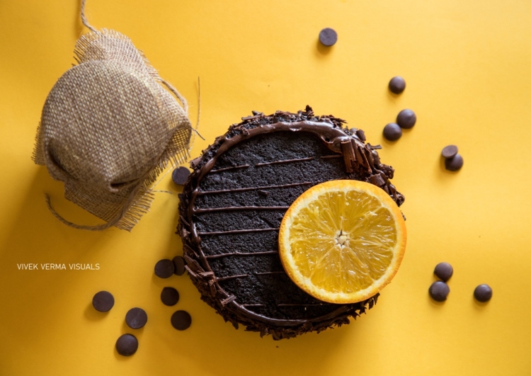
Form is always three-dimensional and encloses volume, having length, width, and height. It creates a sense of depth either through lighting or perspective. Form is often visualized with indistinct borders or edges.
A cube seen from an angular position highlights the form while the same cube seen straight onto only reveals the shape (i.e., square). Geometric forms can be mathematical and precise, e.g., sphere, cube, pyramid, cone, and cylinder. Organic forms can be free-flowing, curvy, asymmetrical and thus cannot be easily measured.
Artists: Leonardo da Vinci, Michelangelo, Rambrandt, Mark Rothko and Georgia O’Keeffe
03
Texture
Texture gives a visual sense of depth and characteristics of the surface of an object, revealing how it may feel upon a physical touch. It is not only about the roughness, but also about the smoothness.
Texture is subject to manipulation and can be created to look like something that it is not (e.g., faux leather). Such textures are called visual or implied texture. It can be used in an artwork to create visual interest or a focal point, balance visual weight of the composition, or create contrast with another element in the composition.
Artists: Vincent Van Gogh, Anselm Keifer, Justin Gaffrey, Jan Van Huysum, Lucian Freud, Duane Hanson, David Hockney, Max Ernst, Joan Eardley, Antonio Tàpies
Application of Shape, Form & Texture in Photography

- Circles introduce energy and movement in a photograph as the eyes are constantly directed around the image;
- Squares and rectangles give a feeling of stability and solidity, particularly, when large;
- Regular shapes (circles, squares and equilateral triangles) convey a sense of order and stability;
- Organic or curved shapes suggest relaxation and calmness.

TRIVIA
- Wassily Kandinsky, considered as one of the pioneers of abstract modern art, painted geometric shapes to represent spirituality and emotions.
- Reduction of an image into flattened lines and shapes was key element of Cubism. Picasso and Brauque created surrealistic artwork using cube as a shape.
S H A P E
- Silhouette is a good example of creative use of shape;
- Front or back lighting can be used to emphasize the shape;
- Colours help you pronounce the ‘flatness’ of shape better;
- As the details of the subject are hidden, shape creates mystery element around the main subject;
- Negative shapes (having no tangible form of their own but are made with objects around them) can also be used creatively to create great composition.


- Highlight shows the area where light hits the subject directly.
- Mid-tone shows a middle value of the colour of an object, which is neither directly hit by light nor opposite to the direction of light.
- Core shadow shows the area that is directly opposite to the direction of light and hence shaded on the object.
- Cast shadow shows the area that is shaded on surrounding objects and surfaces because of blocked light.
F O R M
- Shadows help in emphasizing the depth;
- Seeing the subject from an angle (not straight) also creates depth;
- Prefer sidelight over direct straight light;
- Black-and-white is often preferred over colour to emphasize depth (due to tonal range);
- Use soft light to create tonal gradations that can give your subject depth;
- Be mindful of layers (foreground, midground and background) in your composition to give a sense of depth;
- Reflections can also add form;
- Consider setting your EVF (electronic viewfinder) to display in black and white to see and identify forms more easily;
- Create the illusion of form by understanding how light reacts on the object;
- Telephoto lenses reduce the depth (hence form) by compressing the scene, while wide-angle lenses increase depth by exaggerating the perspective;
- Use dodge and burn tools during post-processing to emphasize the depth.

TRIVIA
- Rembrandt’s effective use of light and shadows created a convincing sense of atmospheric space and depth (form) in his paintings. His painting style is still considered the industry standard for portrait lighting to create depth and emphasize the form.


T E X T U R E
- As sense of touch is the least used of all our senses, you can emphasize texture to make an object appear more real for the viewer and thus create interest even in mundane objects;
- Use supplemental lights and shadows to convey a sense of touch or texture;
- Avoid direct or overhead lighting which can create too much of contrast. Instead, use side or directional lighting;
- Try experimenting with contrasting textures;
- Use soft light to convey smoothness of a texture and hard light to convey roughness of a surface;
- When you focus on your subject, be mindful of the effects of texture, and choose wisely whether to emphasize or minimize the texture;
- Avoid underexposure and overexposure as they both lead to loss of details;
- Use high F-number (F 8.0 or above) to retain details of the surface;
- Consider using a tripod and in-built timer to avoid any camera shake that may lead to loss of texture details;
- Prefer a lens with macro capabilities, if available;
- Using leading lines (whether leading to the texture part or within the texture itself) may help you create a more compelling image;
- Too much of texture (e.g., wrinkles on an old person’s face) or lack of sufficient texture (e.g. extra smooth skin of a model) may create a sense of disconnect with the viewer.

“I aim for an abstract element of a realistic subject and use texture to add interest and suggest depth.”
– Margaret Roseman

2 thoughts on “Seven Elements of Visual Art: Shape, Form & Texture (Part I)”